Global Events & Market Trends
An interactive visualization project for exploring how stock market and GDP trends line up with wars, pandemics, and other global events across regions.
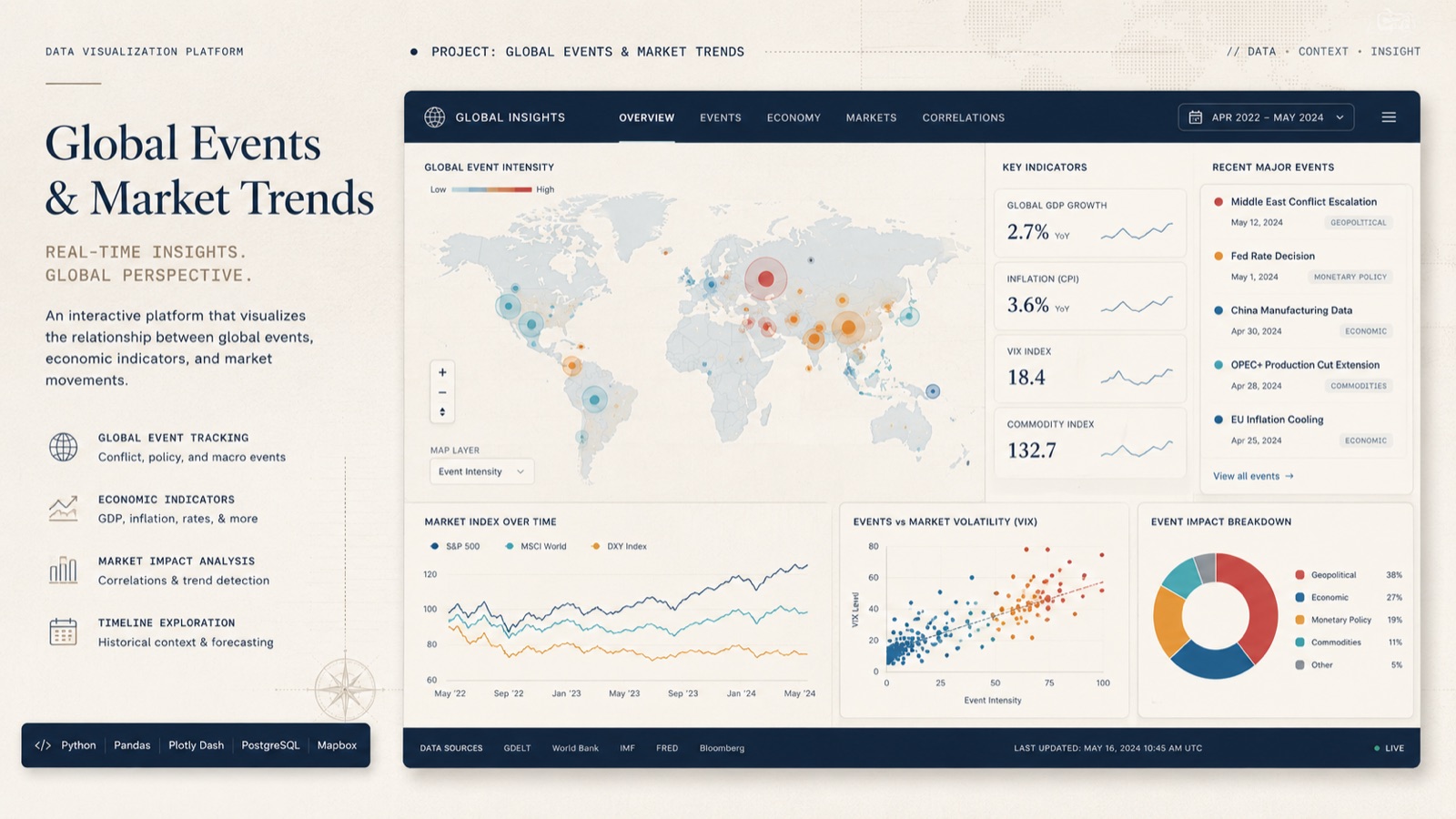
Putting a trend back in context
A change in a market chart raises questions about what was happening around it. This project began with one of those questions: do major global events leave patterns that can be seen across stock market and GDP data?
I built an interactive way to investigate that question across regions and event types. Economic series and event timelines provide the comparison; geospatial views show where the patterns occur.
Following a question through the data
Filters let the viewer narrow the selection and examine the corresponding trends. A regional view helps compare places, while the timeline gives changes a historical context. Moving between them supports questions such as whether a pattern appears in several regions or is concentrated in one.
The interaction is intended to make exploration active. Someone can change the selection, inspect the resulting view, and refine the question as they go.
Preparing the data and presenting the comparison
Python and Seaborn support data preparation and exploratory analysis. The interactive layer uses D3.js and Plotly.js inside Observable, bringing charts, geographic views, and filtering into the same environment.
Each view contributes a different kind of context: time establishes sequence, geography establishes location, and the economic series show the measured changes. Keeping those relationships visible helps a reader understand what is being compared.
What the charts can support
A shared timeline can reveal an association worth investigating. Establishing that an event caused an economic change requires additional analysis of other influences and the underlying data. The project supports exploratory comparison, with the filters helping readers examine how a pattern changes across selections.